18th & Vine (Sporting KC)
Creative Direction & Design
Rooted in the cultural heartbeat of 18th & Vine, this concept draws from the early age of jazz - an art form born of improvisation, collective energy, and radical freedom. Jazz rejected fixed perspective and hierarchy, bringing every element to the foreground at once. Musicians improvised simultaneously, each voice distinct yet inseparable from the whole, creating a dynamic tension that felt spontaneous, rebellious, and alive. Artists and painters of the era sought to translate this experience visually, using geometric forms, repetition, collage, and multiple perspectives to mirror rhythm, syncopation, and sound made visible.
As jazz evolved into bebop, the visual language followed - becoming more jagged, asymmetrical, and dissonant. Beauty emerged from mistakes, clashes, and complexity, embracing the idea that form could be broken to unlock greater expression. Influenced by figures like Stuart Davis, Francis Picabia, Arthur Dove, and musicians such as Louis Armstrong and Thelonious Monk, this approach celebrates synesthesia: the effervescence of spirit where sound, motion, and image converge. The result is a bold, modern aesthetic driven by energy, magnetism, and intensity. Jazz is treated not as nostalgia, but as a living force—one that challenges convention and pushes culture forward.
Design Dichotomy
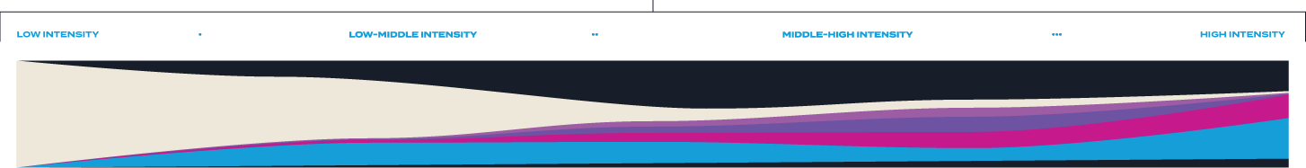
Our tiered design system moves like jazz, aligning visual expression with the emotional rhythm of the season. Low intensity sets a clean, composed baseline - steady, restrained, and professional. Low-middle introduces subtle movement and variation, beginning to build energy while maintaining control. Middle-high amplifies momentum through bolder rhythm and visual complexity, carrying the audience toward peak moments. High intensity marks the crescendo - unrestrained, electrifying, and reserved for moments that demand full attention and elicit powerful fan response.

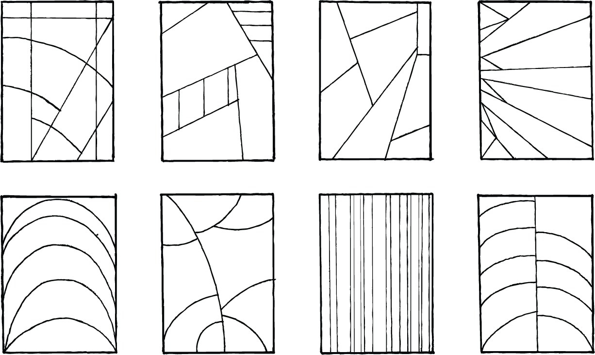
Hand-drawn grids are introduced as a flexible foundation rather than a fixed structure, reflecting jazz’s relationship with form - understood, respected, and intentionally bent. Like jazz compositions that establish a framework before breaking into improvisation, these grids exist to be disrupted, fractured, and reinterpreted. The act of breaking the grid creates tension, rhythm, and movement, allowing the artwork to feel alive rather than constrained. Soccer mirrors this same balance between structure and instinct, where spacing and formation exist only to be reshaped in the moment. Within the system, the hand-drawn grid becomes a starting point - not a rule - reinforcing a visual language built on freedom, responsiveness, and expressive momentum.
Hand-drawn textures are intentionally introduced to bring human energy, imperfection, and spontaneity into the visual system, reflecting the improvisational spirit at the heart of jazz. Like jazz musicians responding to one another in real time, these textures introduce rhythm and variation that disrupt rigid geometry and polished surfaces. Soccer echoes this same sensibility - fluid, reactive, and shaped by instinct within structure - reinforcing the relevance of this approach without overpowering it. They create a sense of motion and emotional depth, helping graphics feel lived-in and expressive rather than fixed or mechanical. Within the system, hand-drawn elements act as visual syncopation—accenting key moments, amplifying intensity, and reinforcing the idea that the brand moves with feeling, momentum, and instinct.
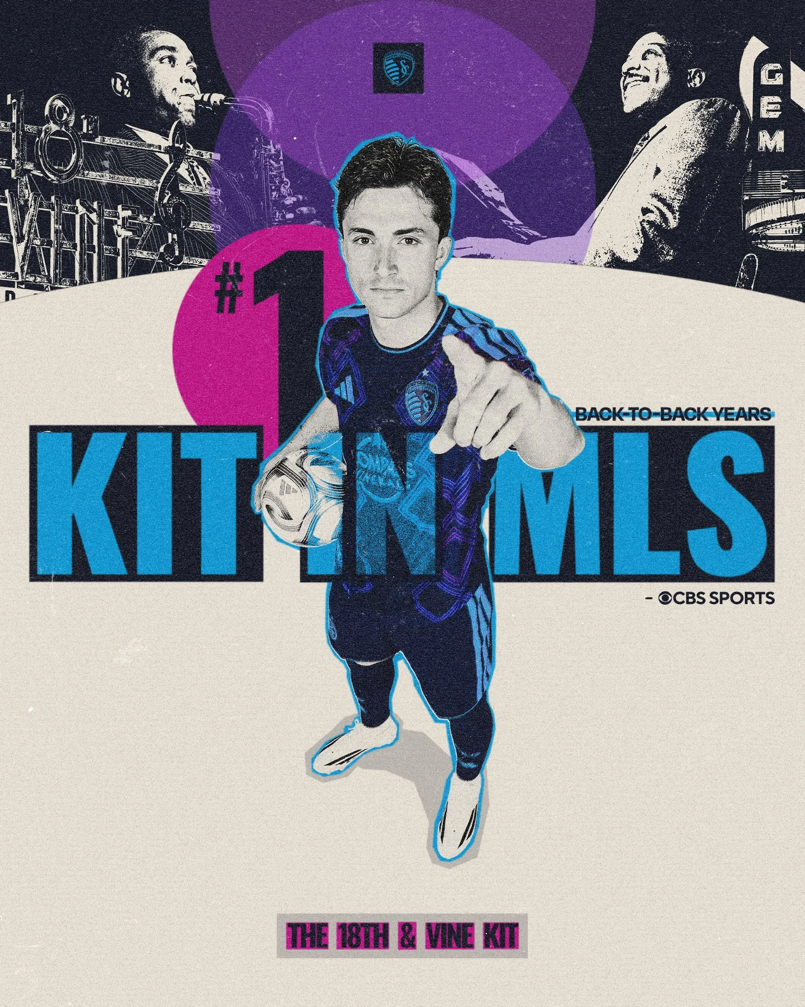
18th & Vine Kit (2026-28)
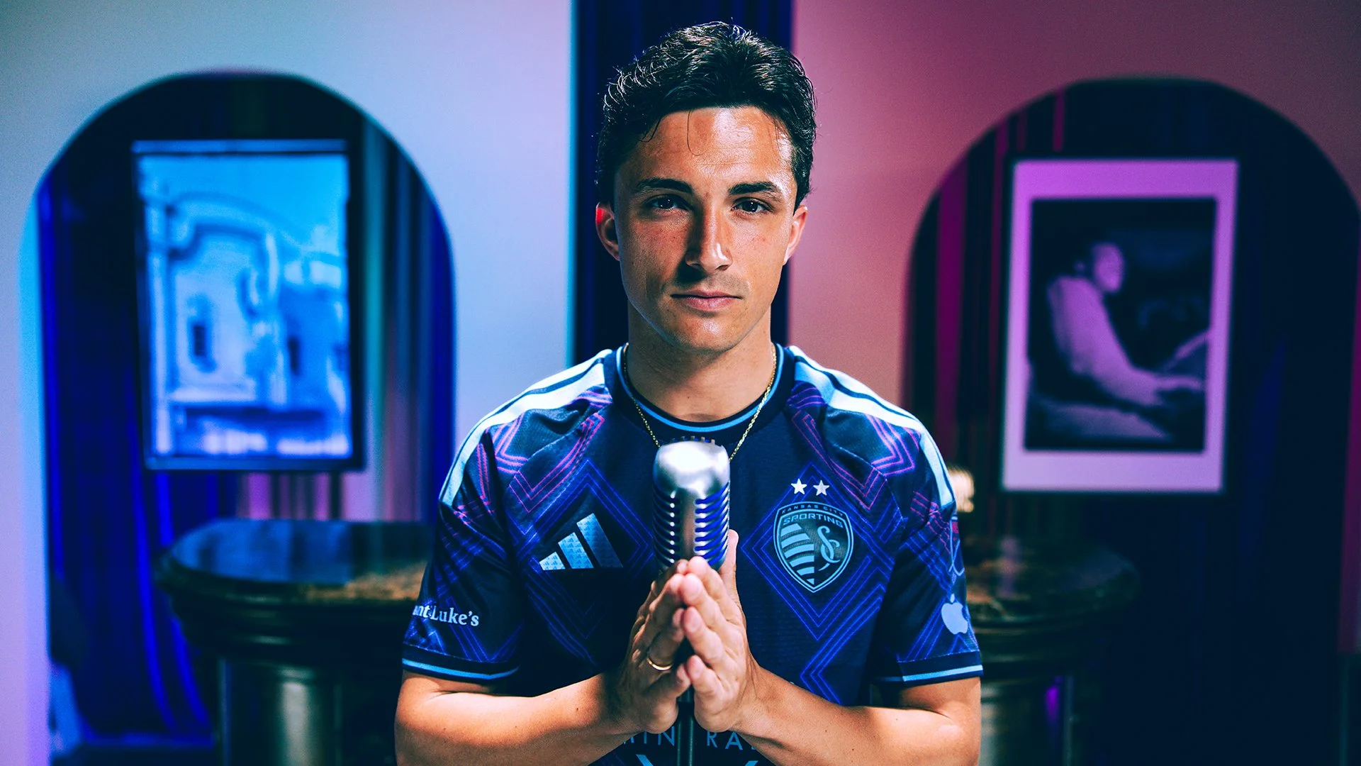
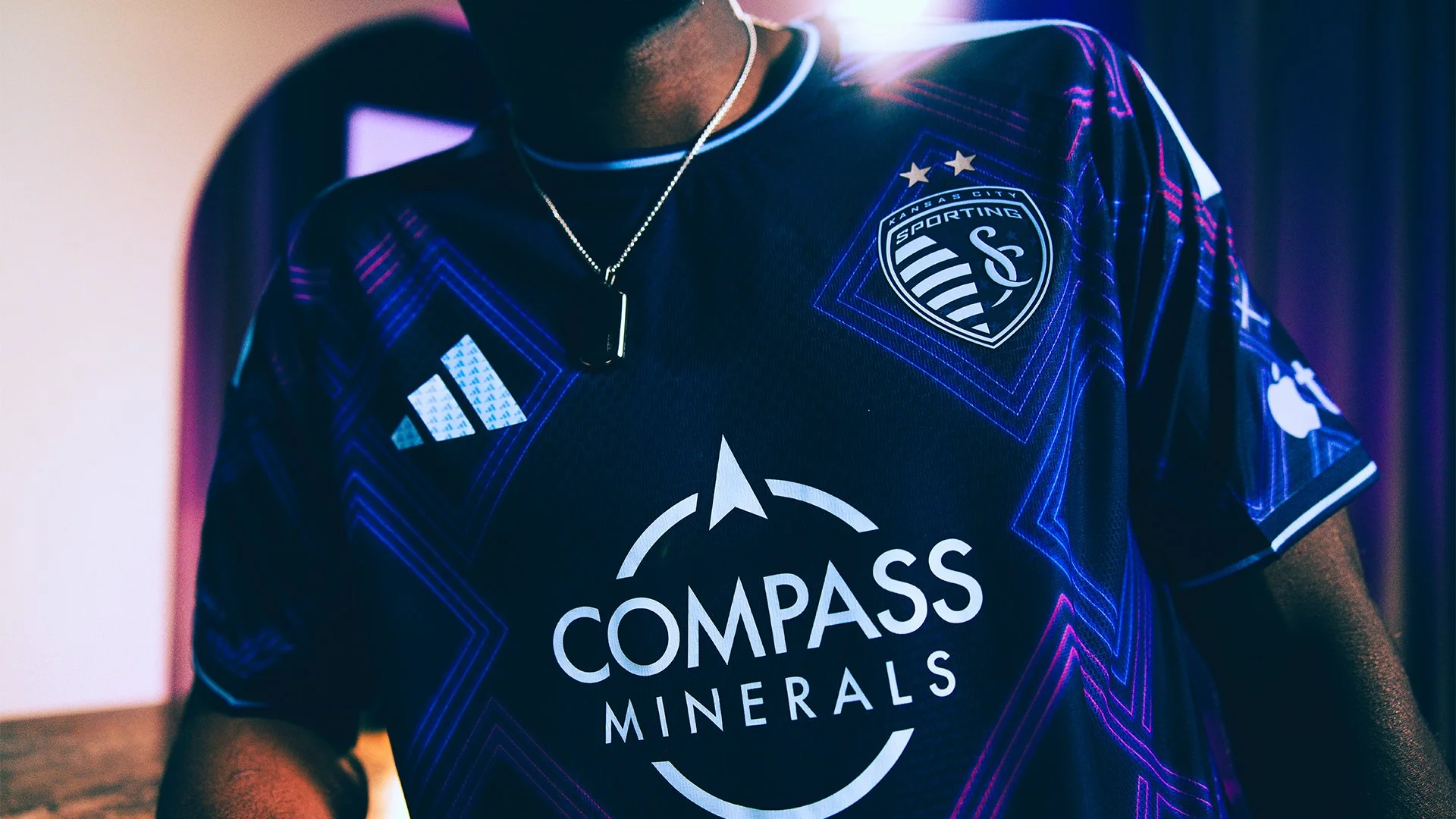
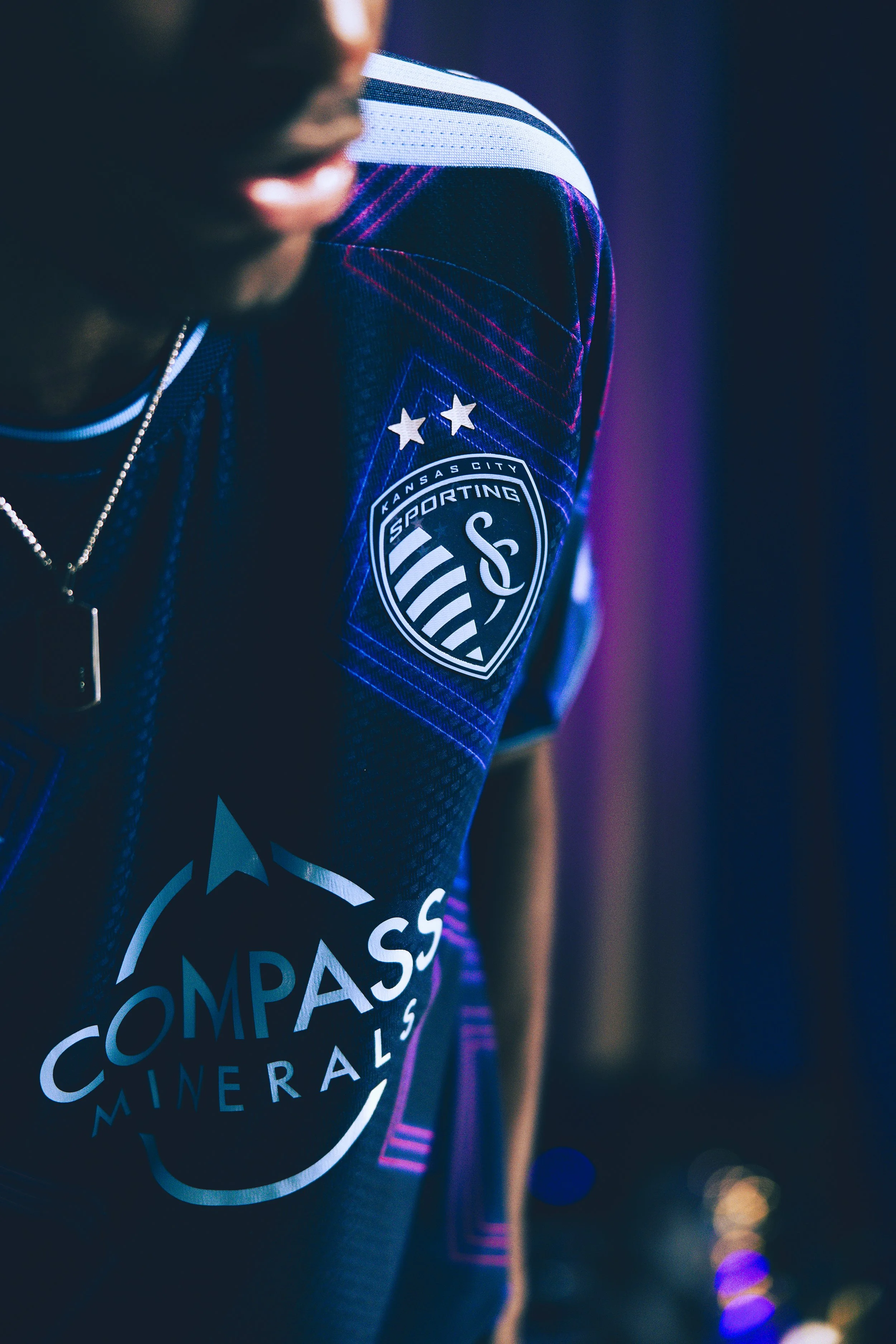
Inspired by the vibrant soul of Kansas City’s 18th & Vine District, this kit pays tribute to the birthplace of jazz and the cultural heartbeat of a community that shaped a nation. Neon accents echo the glow of historical club signs, while every thread carries the rhythm of legends like Charlie Parker and Count Basie. This is more than a jersey…it’s a celebration of history, hertiage, and the sound that made Kansas City swing.
This kit drew inspiration from the neon-lit streets of Kansas City where jazz still rules the soul. Bright, glowing accents draw from the iconic signage of venues like The Blue Room and Gem Theater, bringing the district’s timeless energy to life through Sporting KC’s brand element: The Argyle Diamonds.
Inside the collar, the kit features sheet music from the iconic song “Kansas City (Here I Come)” by Wilbert Harrison. A timeless anthem that has carried the city’s name across generations. On the back neck, a stylized “Sporting Kansas City” wordmark glows in a neon-inspired script.
Kansas City Here We Come
———
Shot and Edited by Two Circles
Voiceover by Bob Kendrick

The Team Behind the Creative
Creative Direction: Nate Saathoff
Agency: Two Circles
Design Team: Sayler Rivas, Max Paxton, Jessi Carpenter, Cole Middendorf
Video Team: Tiegan Hartley, Conall McCourt, Havy Do, Hayden Spratlin
Photo Team: Alex Lorenzo
Kit Team: Chad Reynolds, Thomas Earle, Adidas