Sporting KC Brand Refresh
Creative and Brand Direction
By 2025, Sporting Kansas City's visual identity had served the club well for more than a decade. The 2011 rebrand had defined an era. But the world around it had changed. Type systems had evolved. Accessibility standards had matured. Digital-first storytelling demanded more flexibility than the old system could give. The question was not whether to evolve, but how.
I led the refresh with one guiding principle. This was not going to be a tear-down. It was going to be a surgical, deliberate evolution of something that still had equity worth protecting. The work started with typography: a new headline font built for impact, an ADA-compliant sans for accessibility, and a body family engineered for the flexibility modern sports brands require across every surface they live on.
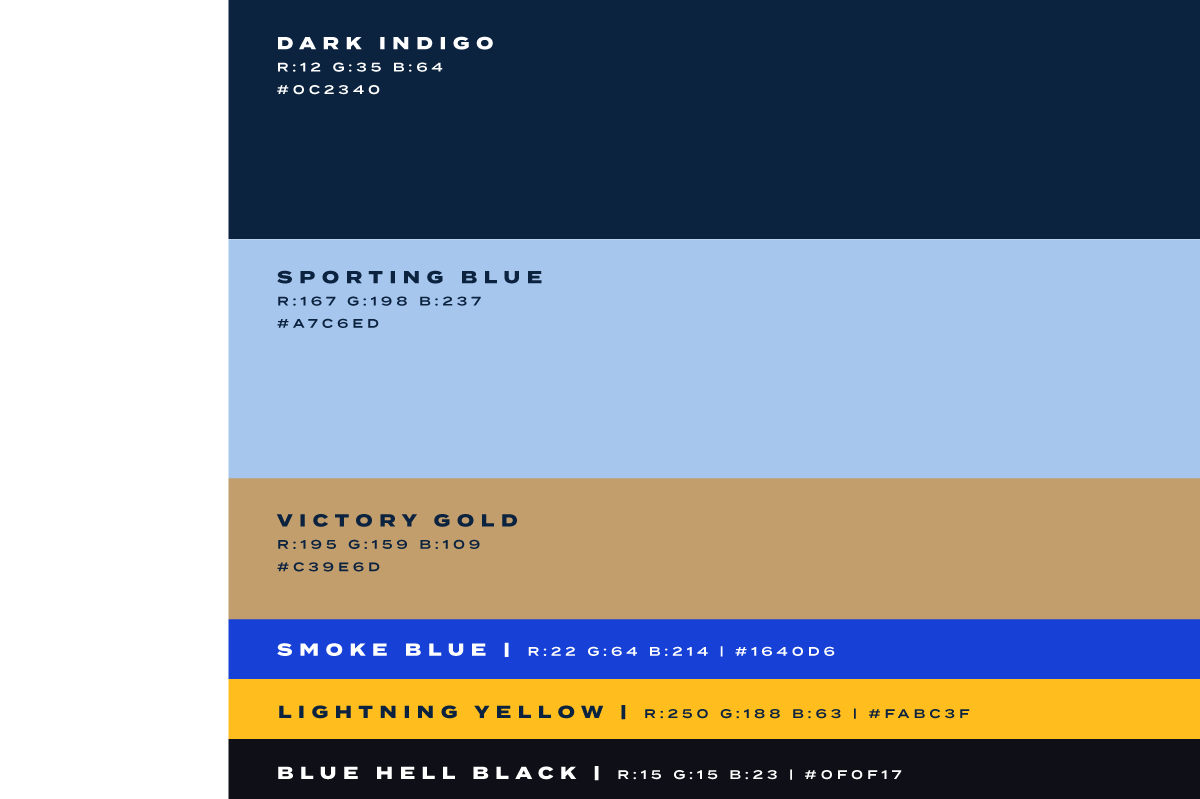
Then came Victory Gold. A metallic accent color that had existed in Sporting KC's pre-2011 branding documents but never made it into the actual identity. We brought it back. Not because gold was trending, but because it belonged to the club. It was always part of the story. It just needed someone to make the case.
The refresh is still live. Victory Gold is already showing up across the brand and will define the club's future kit cycles. The type system is quietly at work across every touchpoint Sporting KC touches. This was not a rebrand anyone announced with fireworks. It was a rebrand designed to last a generation.
Design Dichotomy

Aligning the visual intensity of Sporting KC’s content with the emotional intensity of the season.
Sporting KC’s tiered design system aligns the visual intensity of their content with the emotional rhythm of the season. Low-intensity designs establish a clean, professional baseline. Mid-tier momentum ramps up energy and bridges the calm with the peak moments. The Blue Hell intensity is reserved for electrifying, make-or-break moments that command attention and ignite strong fan reactions
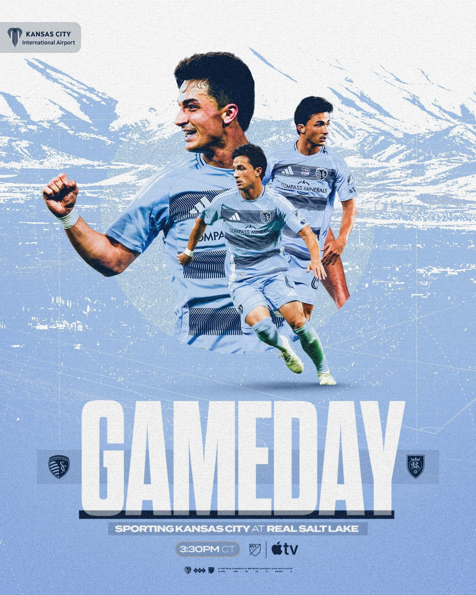
Level Two - Middle-Intensity
Level Two creative elevates the brand for in-season moments, league games, awards, and day-today graphics that demand more energy than foundational content. These designs are dynamic and expressive, building on the structure of Level One while introducing asymmetry, motion, and a subtle increase in texture.
Sporting Blue and Dark Indigo dominate at this level with inclusion of Victory Gold, amplifying passion and excitement without overwhelming the viewer. Imagery focuses on moments of intensity and raw emotion, evoking the thrill and anticipation of a Sporting Kansas City gameday.
Level One - Low-Intensity
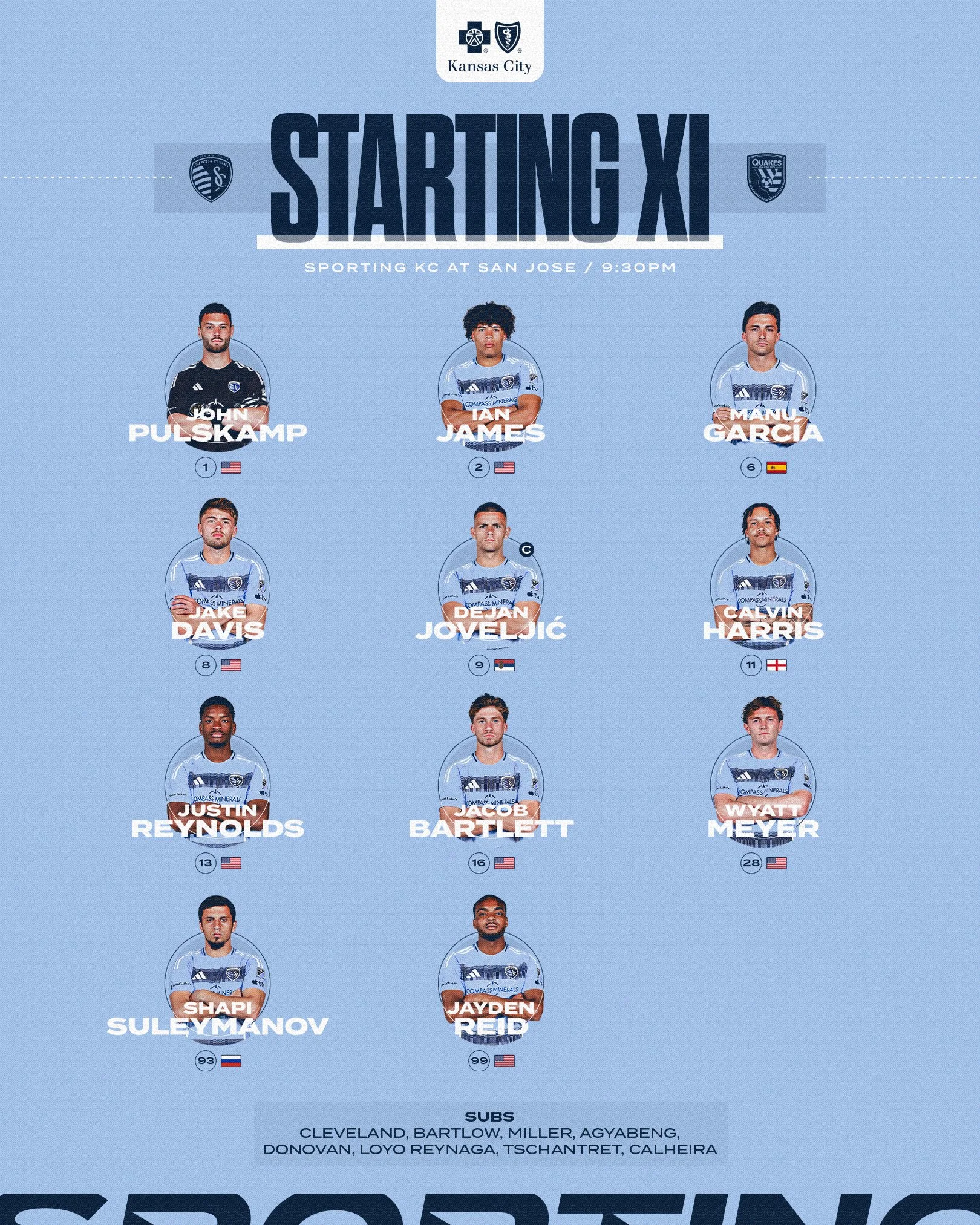
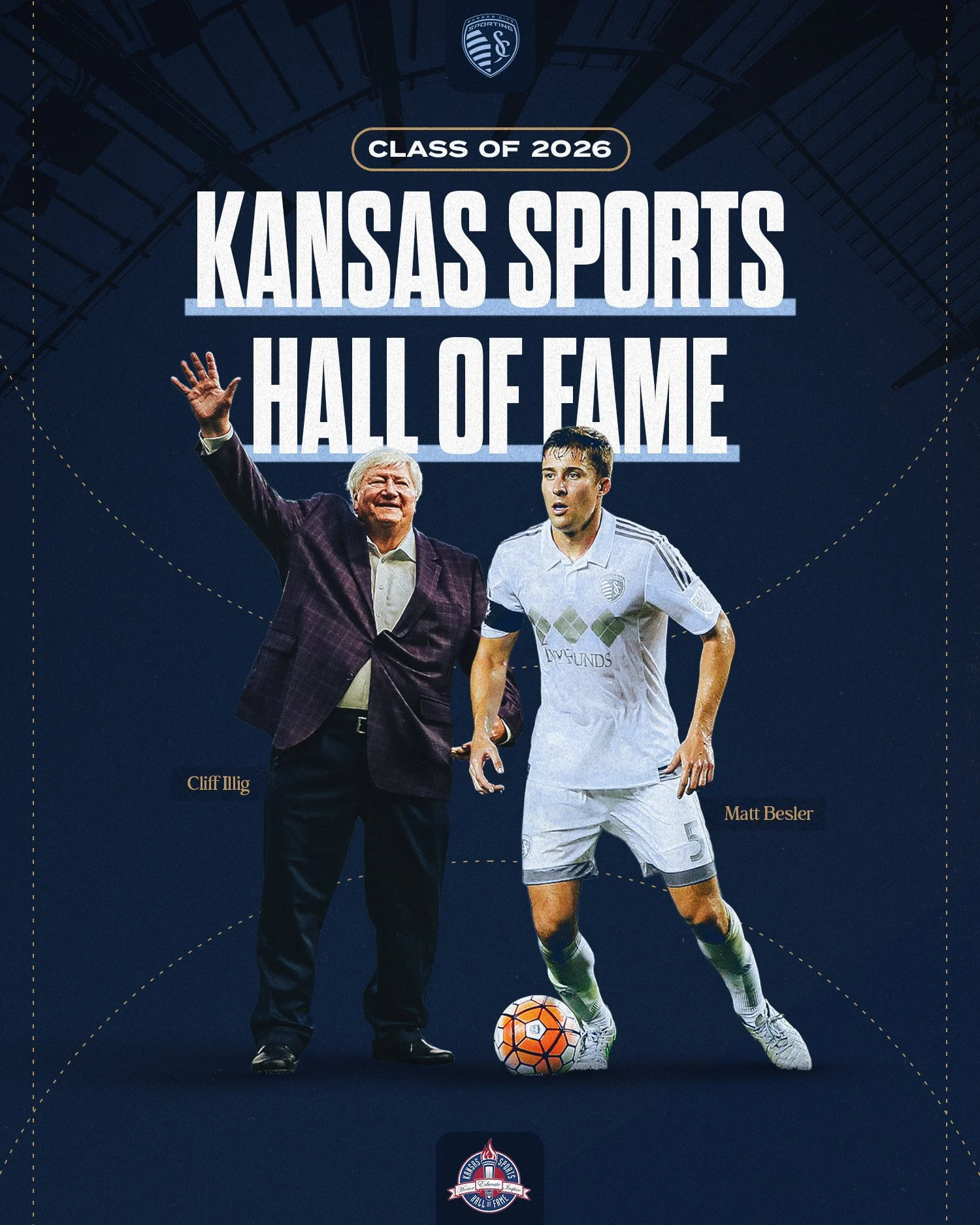
Level One creative reflects Sporting Kansas City’s foundation, prioritizing clarity and simplicity for calm periods, front office communications, and day-to-day content. The design is minimalist and clean, anchored by Sporting Blue and Dark Indigo.
Layouts are symmetrical and grid-based, with generous white space and restrained use of texture or noise. This approach conveys professionalism and consistency, setting the tone for off-season content, press materials, and low-stakes gameday graphics.
Level Three - Blue Hell Intensity
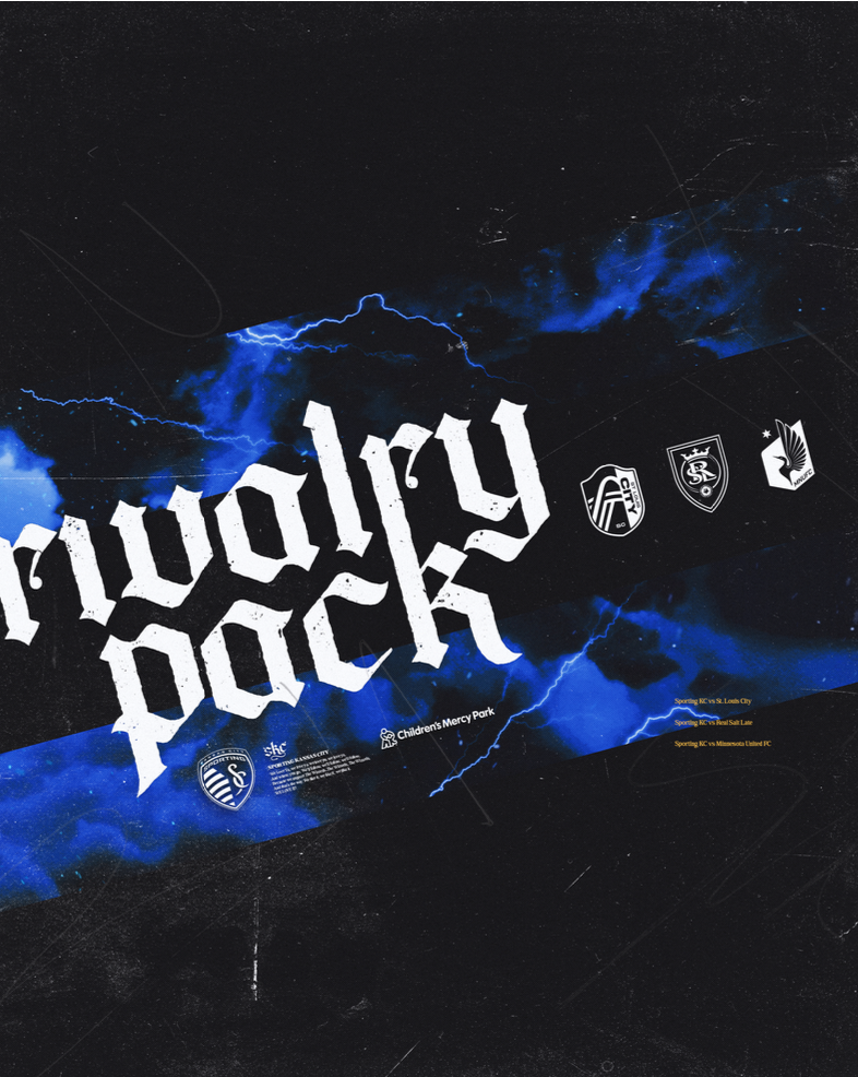
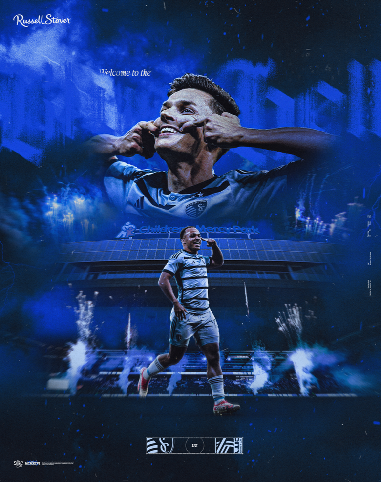
Level Three creative represents Sporting Kansas City at its most fierce and passionate. It is reserved for the highest-stakes moments, tournament runs, rivalry games, and in-stadium experiences. Blue Hell intensity captures the raw energy of our players and the electric atmosphere of our fans, channeling the chaos of a dark Midwest storm rather than relying solely on blue flames or embers.
These graphics are bold, aggressive, and emotionally charged. They command attention through layered textures, brush strokes, noise, and distortion, creation compositions that feel electric and unpredictable while maintaining controlled chaos.
The emotion of this level is pure adrenaline. Blue Hell creative ignites excitement, evokes passion, and connects directly with our most devoted supporters, fully embodying the essence of Sporting Kansas City
Our Color Run Deep…
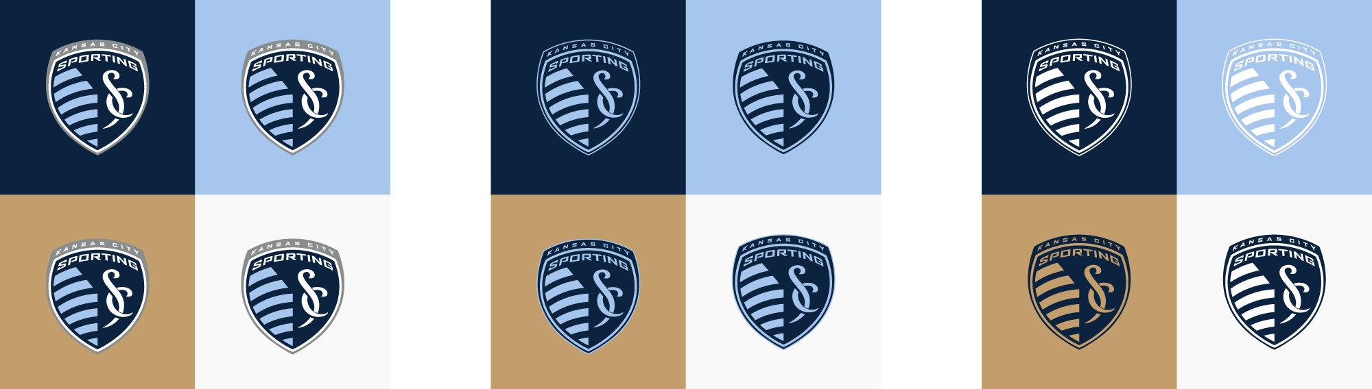
Sporting Blue, Dark Indigo, and Victory Gold define Sporting Kansas City’s visual identity. These primary colors anchor the brand, delivering an instantly recognizable look rooted in the club’s heritage.
Level One graphics use a clean, primarily white base accented by Sporting Blue and Dark Indigo for a fresh, polished appearance. Level Two builds on this intensity, with Sporting Blue and Dark Indigo leading while subtle white and Victory Gold details provide balance.
At the highest intensity, Blue Hell graphics deliver bold energy. Blue Hell Black and Smoke Blue dominate, with precise touches of Sporting Blue and Lightning Yellow heightening the drama. This cohesive, vibrant system reflects Sporting KC’s legacy and injects a modern edge.
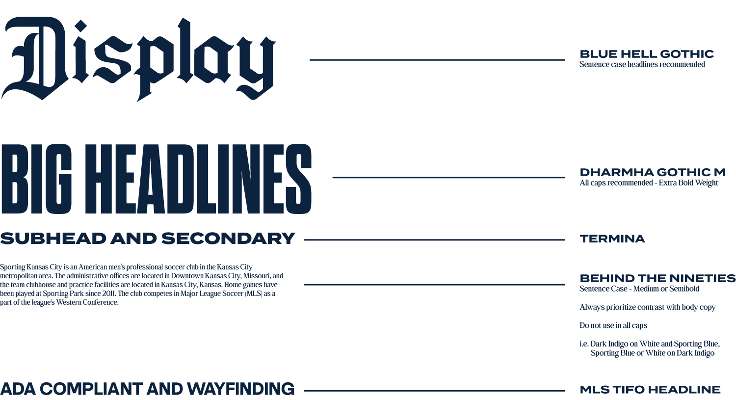
Typography System
Blue Hell Gothic, SKC’s display typeface, commands attention in large formats. This blackletter design channels the spirit of the Blue Hell, delivering raw energy and grit for it’s most impactful visuals.
Dharma Gothic M serves as the headline typeface, a compressed sans-serif that brings a modern edge and immediate impact. It pairs seamlessly with Blue Hell Gothic, ensuring the club’s messaging is bold and unmistakable.
Termina functions as the subheading typeface. Its wide, extended design provides strong readability and balances the intensity of SKC’s headers, creating a clear hierarchy across all applications.
Behind the Nineties is the body copy typeface, chosen for its exceptional legibility at smaller sizes. Its refined serif style supports storytelling and long-form content while integrating effortlessly into the larger system.
MLS Tifo Headline is used in moments where accessibility and universal clarity are paramount. As Sporting’s ADA-compliant typeface, it anchors wayfinding and directional signage within Sporting Park, website and beyond. Its clean, highly legible structure ensures that every fan, regardless of ability, can confidently navigate the Sporting experience.
Together, these typefaces create a modern, dynamic typographic system that drives visual impact and reinforces the Sporting Kansas City brand at every level of communication.
The Team Behind the Creative
Creative/Brand Direction: Nate Saathoff
Design Team: Sayler Rivas, Max Paxton, Jessi Carpenter, Cole Middendorf